What might be causing
the low sign-up rate?

KB Bank
Client
PetCare Plus Clinic
Services
UI/UX 100%
Industries
Healthcare
Date
March 2024


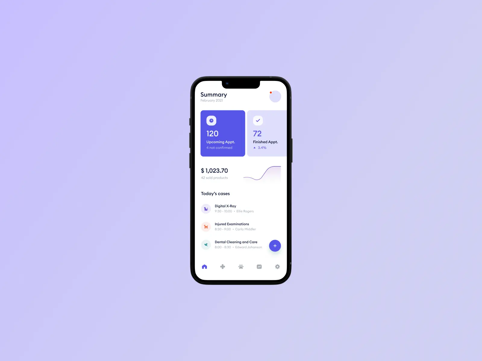
"Paws & Plans" offers a comprehensive suite of features to streamline every aspect of your pet's healthcare journey. With an intuitive calendar system, scheduling veterinary appointments has never been easier. Additionally, the app provides medication reminders, ensuring your furry friend stays on track with their treatment plan. Accessing your pet's medical records is a breeze with "Paws & Plans," allowing for seamless communication with your veterinarian and ensuring continuity of care.
"Paws & Plans" offers a comprehensive suite of features to streamline every aspect of your pet's healthcare journey. With an intuitive calendar system, scheduling veterinary appointments has never been easier. Additionally, the app provides medication reminders, ensuring your furry friend stays on track with their treatment plan. Accessing your pet's medical records is a breeze with "Paws & Plans," allowing for seamless communication with your veterinarian and ensuring continuity of care.


Since around 70% of our users were seniors, we conducted user research to better understand their needs. Based on these insights, we developed a set of senior-friendly design principles and applied them to the product.
The CJ The Unban app has approximately 40,000 users, with about 80% being men in their 40s to 60s.
Through an Amplitude-based analysis of the sign-up flow, we identified a 17% drop-off at the terms and conditions agreement step and a 12% drop-off during identity verification.
As a result, only 39.1% of users completed the final document submission to finish registration, indicating significant UX friction within the onboarding process.


Although the sign-up process was the same on both iOS and Android, the initial screen layout differed between the two platforms.
iOS provided a brief explanation of why identity verification was required.
Android, on the other hand, asked for the user's name without any context.
Android users felt uncomfortable being asked to provide personal information without understanding the reason, which led to a higher drop-off rate at that step.
We concluded that it’s more important to explain why information is being requested, rather than just showing what to input.


Previously, asking for personal information without context caused confusion and hesitation.
By adding a screen that explained the purpose of identity verification, we helped users feel more informed and at ease.
As a result, the drop-off rate at this step decreased by about 7%, improving the overall sign-up flow.


The second drop-off point was the “Eligibility Requirements” step, where senior user characteristics became especially important.
The screen was overloaded with too much information and a long list of devices, which likely caused cognitive load and stress for older users.
So we hypothesized that simplifying the terms into three key points would make the screen feel less overwhelming — and decided to revise the design accordingly.


This improvement led to a 12% reduction in drop-off,
and revealed that the way content is structured on informational pages significantly affects how users perceive and respond to it.
This improvement led to a 12% reduction in drop-off,
and revealed that the way content is structured on informational pages significantly affects how users perceive and respond to it.